Under the sign of monochromaticism: everything you need to know about color drenching
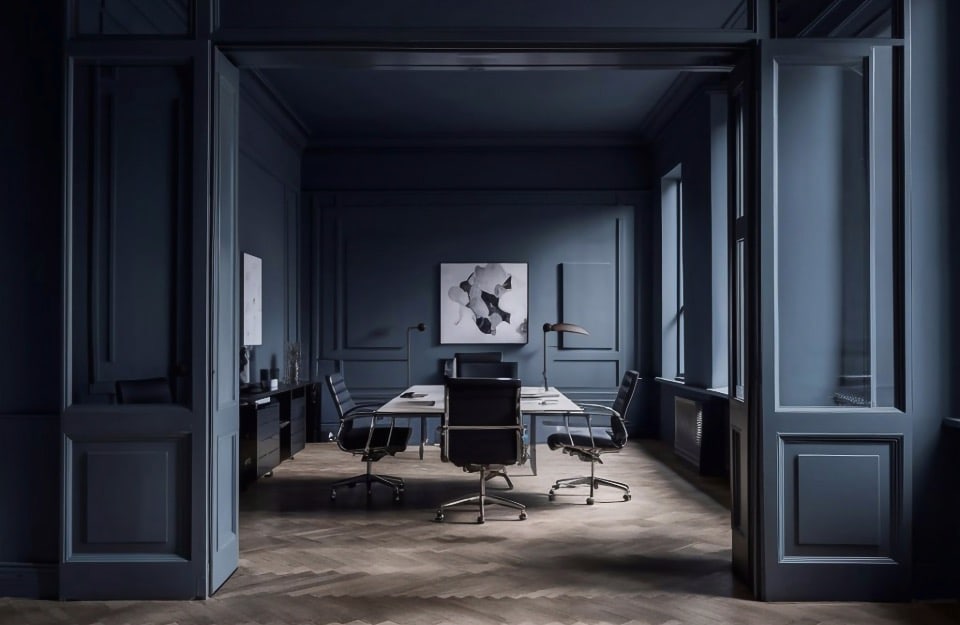
Imagine walking into a room where walls, furniture, floors, and accessories all speak the same chromatic language. Everything is immersed in the same shade, as if the environment had been “drained” of any other color. This is color drenching, one of the boldest and most fascinating trends in contemporary interior design. A technique that transforms space through the totalizing use of color, creating immersive, elegant atmospheres full of character.
If you too are looking for a way to give personality and coherence to your home interiors, color drenching can be the key. But beware: for a flawless result, it is essential to choose paints that guarantee uniformity, versatility, and high aesthetic performance. This is where Rio Verde paints from the Vintage Prestige and Evolution lines come into play: high-performance water-based formulas that adhere perfectly to wood, ceramic, metal, fabric, and plastic, ideal for carrying out a color drenching project on any piece of furniture or accessory… with one caveat: on walls they should only be used for small inserts or decorations.
What is color drenching
The term color drenching literally means “soaking in color”.
In practice, it is an interior design technique that involves using a single shade not only to paint the walls, but also doors, baseboards, furniture, ceilings, and accessories. Everything coordinated, everything immersive. A single hue dressing the entire environment, creating a cohesive, elegant, and deeply emotional effect.

A brief history of color drenching
Although it has only become a viral trend in recent years, color drenching has much deeper roots. As early as the modernism of the early 20th century, a chromatic unity capable of bringing order and meaning to space was sought.
Later, in post-war Scandinavian and Japanese design, uniform color was synonymous with visual cleanliness.
Today, however, color drenching has become an emotional strategy: a style choice, of course, but also a way to visually embrace space and let yourself be embraced by it.
Why choose color drenching
- Makes small rooms appear larger by eliminating visual contrasts.
- Creates a sense of order and aesthetic continuity.
- Enhances light, natural or artificial, depending on the shades.
- Communicates personality, care, and originality.
- Works in both modern and classic interiors.
When (and where) to avoid color drenching
As striking and impactful as it is, color drenching is not suitable for every situation. There are contexts in which its totalizing effect risks weighing down the space rather than enhancing it. Here are some cases where it’s better to avoid it — or apply it with moderation:
- in very small rooms without natural light: a windowless bathroom, a narrow corridor, or a closet can feel oppressive if completely “soaked” in dark color. The risk is a “closed box” effect;
- in very large and bare rooms: paradoxically, even large spaces can appear flat and cold if fully monochromatic, especially if the chosen color is neutral. In these cases, it’s better to alternate finishes or add material touches (like textiles, plants, or artwork);
- if you need flexibility: color drenching is a strong choice and not easily reversible. If you enjoy frequently changing layout or style, you may feel “trapped” within that hue;
- to enhance particular architectural elements: in spaces with exposed beams, wainscoting, niches, or historic walls, a uniform color could cancel out structural features instead of highlighting them.
How to achieve it with Rio Verde paints
One of the most critical aspects of color drenching is achieving a truly uniform effect across different surfaces.
This is where the Rio Verde Vintage Prestige and Evolution paint lines come in: opaque, multi-surface, high-coverage paints. They are perfect for coloring wood, metal, ceramic, plastic, fabric, glass, and MDF.
Note: they are not suitable for covering large wall surfaces but can be used for small wall portions or decorative elements such as wainscoting, moldings, niches, and skirting.
The available shades are countless: from retro pastels like Frappè, Cocco, and Lattementa to sophisticated neutrals like Tortora, Cemento, and Piombo. All designed to create coherent and harmonious interiors.
Where to use color drenching (and how)
- Entrance or hallway
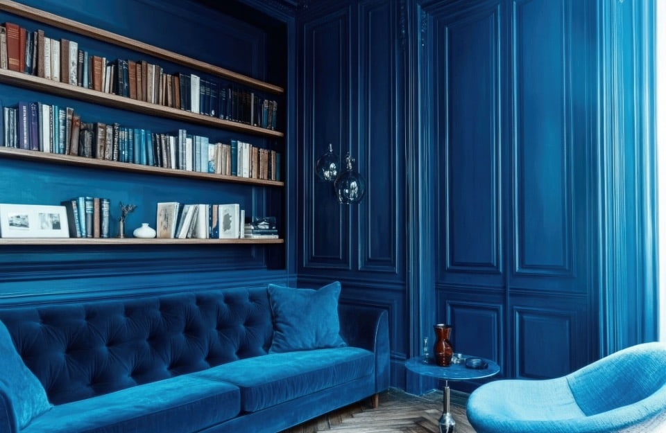
Perfect for bold choices. You can use intense or dark shades and paint everything: walls, doors, storage furniture, frames. The result will be dramatic and surprising. - Living area
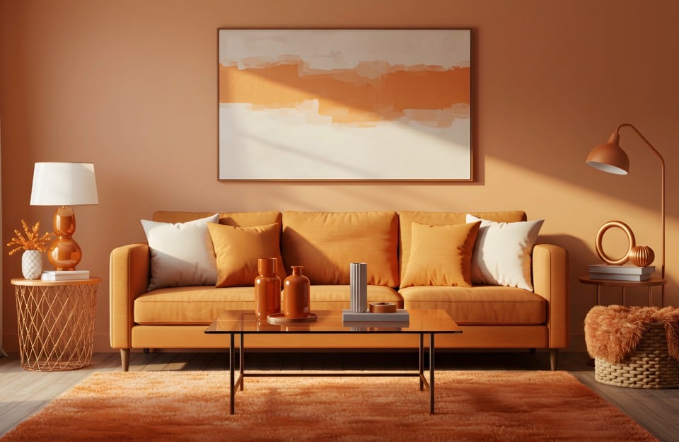
Choose an enveloping shade like marzipan or truffle. Apply the paint on coffee tables, shelves, chairs, vases. You can extend it to wall portions to add depth. - Kitchen
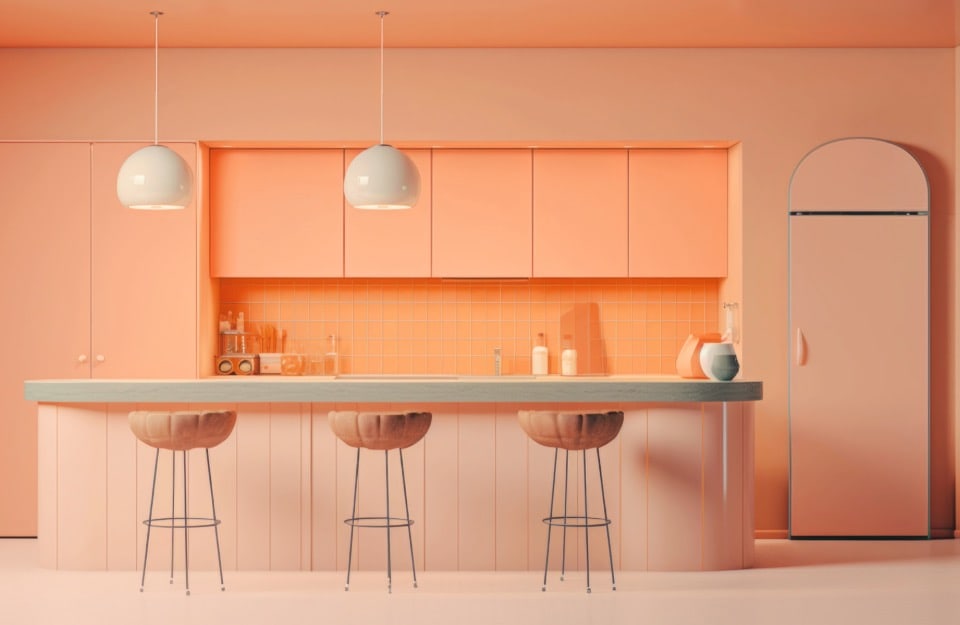
Here, color drenching helps create visual order. Paint chairs, shelves, wooden elements, accessories. Opt for functional tones like cement or lead gray. - Bedroom
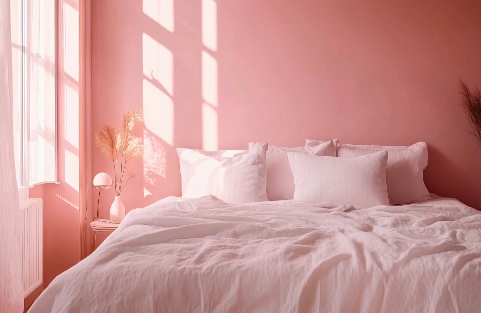
The drenching style is ideal here: it creates relaxation and coherence. Paint nightstands, headboards, mirrors, secondary furniture. Light, creamy tones work wonderfully. - Bathroom
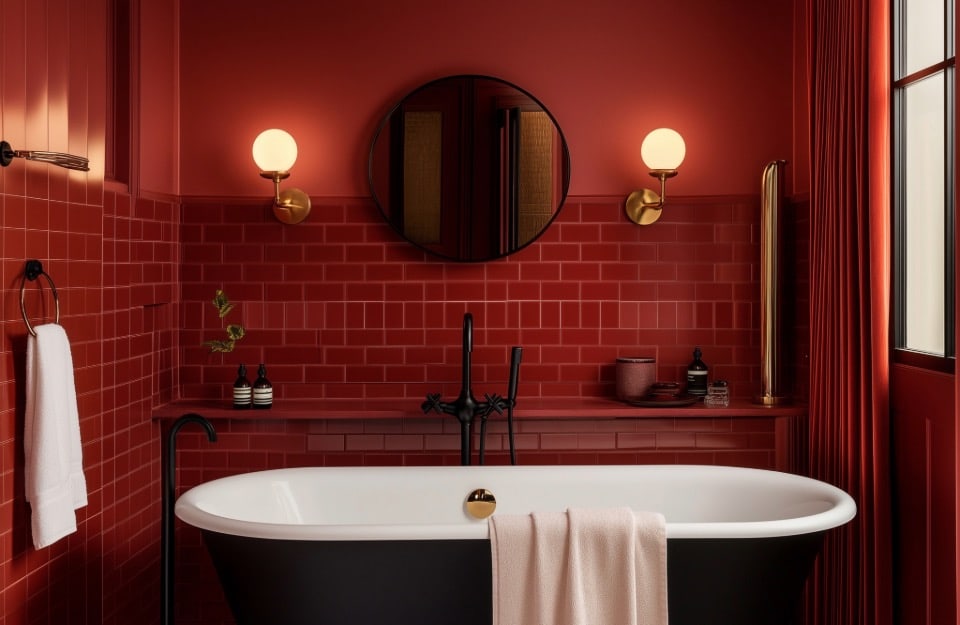
Even in small spaces, drenching works. Choose dark colors like anthracite or taupe, and apply them to bathroom furniture, shelves, wooden or ceramic details.
What is pattern drenching
Pattern drenching is a decorative variant of color drenching that involves not the use of a single hue, but the obsessive and immersive repetition of the same pattern.
Floral, geometric, striped, optical motifs: the chosen design is replicated on every surface — walls, furniture, textiles, ceilings, floors — creating a total, theatrical, highly stylized effect.
It is not easy to achieve and must be used with care (to avoid an “excess of visual stimuli” bordering on chaos) but it can transform environments such as:
- guest bathrooms or powder rooms;
- walk-in closets;
- reading corners;
- micro-rooms or small bedrooms.
It can be achieved with wallpaper, decorative stencils, or advanced painting techniques. The secret lies in balancing pattern intensity, scale, and color palette, to avoid weighing down the space.
