Japandi 2.0: the Japandi style evolves toward richer textures and a new sense of warmth
The Japandi style, which we have already discussed in the past, continues to enjoy great success thanks to its ability to combine minimalism, functionality and natural materials into balanced, timeless interiors. In recent years, however, this design language has evolved. The needs of contemporary living have led to a more mature and layered version, now increasingly referred to as Japandi 2.0: an evolution that retains its original principles while introducing greater material depth, warmer palettes and surfaces capable of conveying a more enveloping and authentic sense of comfort.
Index
- What is Japandi 2.0 (and why it’s being discussed now)
- Differences between classic Japandi and Japandi 2.0
- Japandi 2.0 palette: warmer, deeper and “dustier” colors
- Wood in Japandi 2.0: grain, medium tones and authenticity
- Materials and textures: the return of tactility
- Finishes and surfaces: matte, natural, non-film-forming
- Japandi 2.0 and healthy homes: indoor air quality and conscious choices
- How to achieve a Japandi 2.0 look: practical room-by-room guidelines
- Rio Verde products for the Japandi 2.0 style
- Mistakes to avoid in Japandi 2.0
What is Japandi 2.0 (and why it’s being discussed now)
Japandi 2.0 is the natural evolution of the Japandi style. From the original — a fusion of Scandinavian and Japanese aesthetics — it retains minimalism, functionality and love for authentic materials, but translates them into a more mature and livable language. If classic Japandi won many over with its ability to bring order and visual calm, today’s homes demand something more: material depth, sensory comfort and a less uniform palette.
Japandi 2.0 emerges as a contemporary response to two very concrete needs:
- more lived-in homes: hybrid spaces (work, relaxation, family life) that require durable and easy-to-maintain materials;
- domestic well-being: interiors that are not only “beautiful to look at,” but also pleasant to experience and sustainable over time.

Differences between classic Japandi and Japandi 2.0
To truly understand the new Japandi (also referred to as new Japandi), it helps to start with what has changed compared to the earlier version. The shift is not drastic. Rather, it is a controlled layering: the style remains essential, but less “ascetic.”
Classic Japandi (in short):
- very light neutrals (white, cream, sand);
- reduced contrasts and uniform surfaces;
- clean, almost graphic aesthetics;
- minimalism that is often more “ideal” than everyday.
Japandi 2.0 (what it introduces):
- medium tones and warmer neutrals (taupe, greige, warm greys);
- visible materiality: grain, texture, imperfect surfaces (in full wabi-sabi spirit);
- measured contrasts: light/dark, smooth/rough, matte/silky;
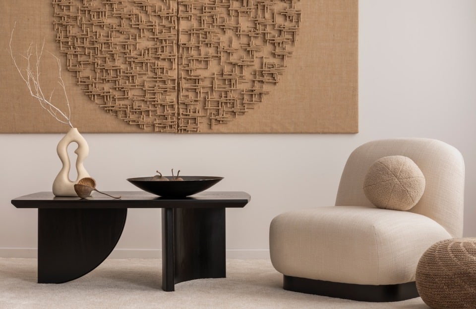
- “cocooning” atmosphere: more enveloping, less “catalog-like,” more intimate.
The result is a style that works better over time: it enhances authenticity and does not require an “immaculate” home.
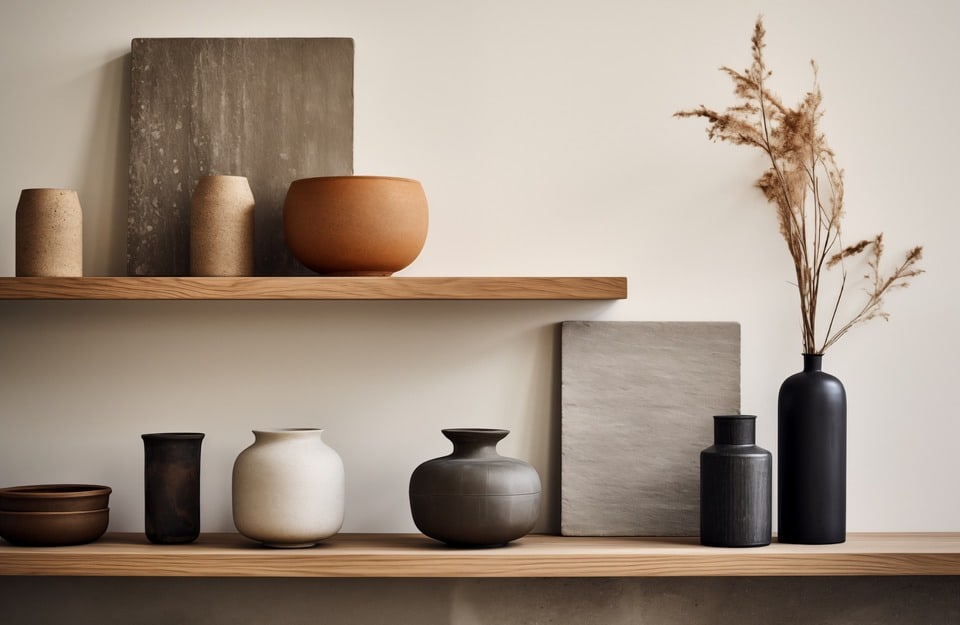
Japandi 2.0 palette: warmer, deeper and “dustier” colors
One of the most obvious signs of Japandi 2.0 interiors is the evolution of the color palette. The myth of “all light beige” gives way — as already mentioned — to a wider range: still measured, yes, but deeper. In Japandi 2.0, color is used to stabilize the space, make it cohesive, support natural light and highlight wood.
Typical colors of the Japandi 2.0 palette:
- taupe and greige (warm neutrals, extremely versatile);
- darker beiges and “toasted” sand (more enveloping than light creams);
- warm and dusty greys (never metallic or cold);
- soft browns (wood, earth, “soft” cocoa tones);
- very controlled accents: charcoal, matte black, desaturated forest green.
A suggestion: it’s better to use a palette with 2–3 core colors and internal tonal variations rather than many different colors. Japandi 2.0 rewards micro-differences: the home feels richer without becoming visually noisy.
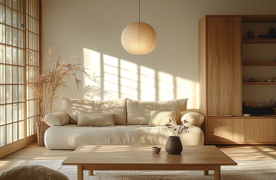
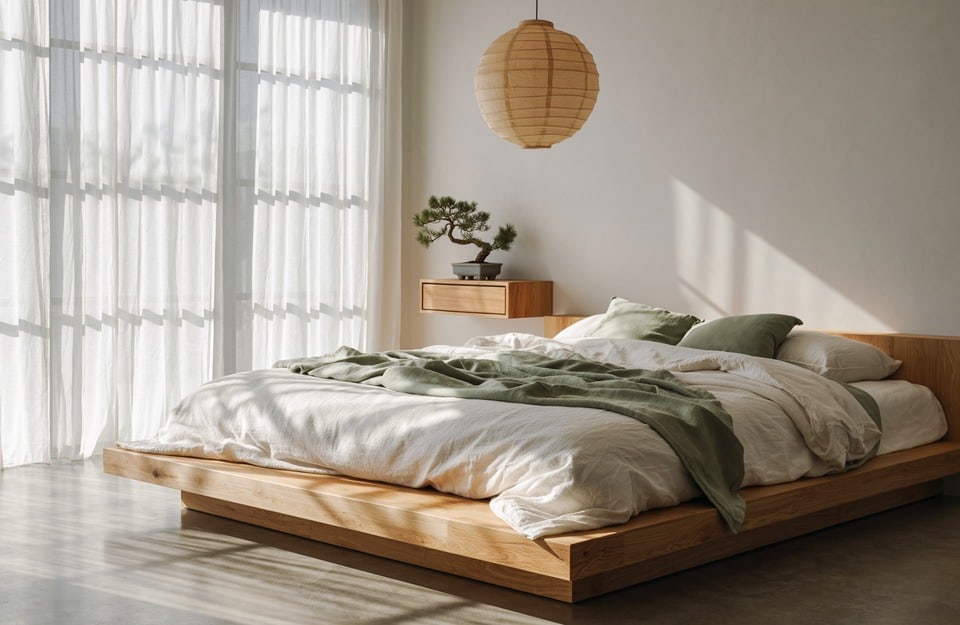
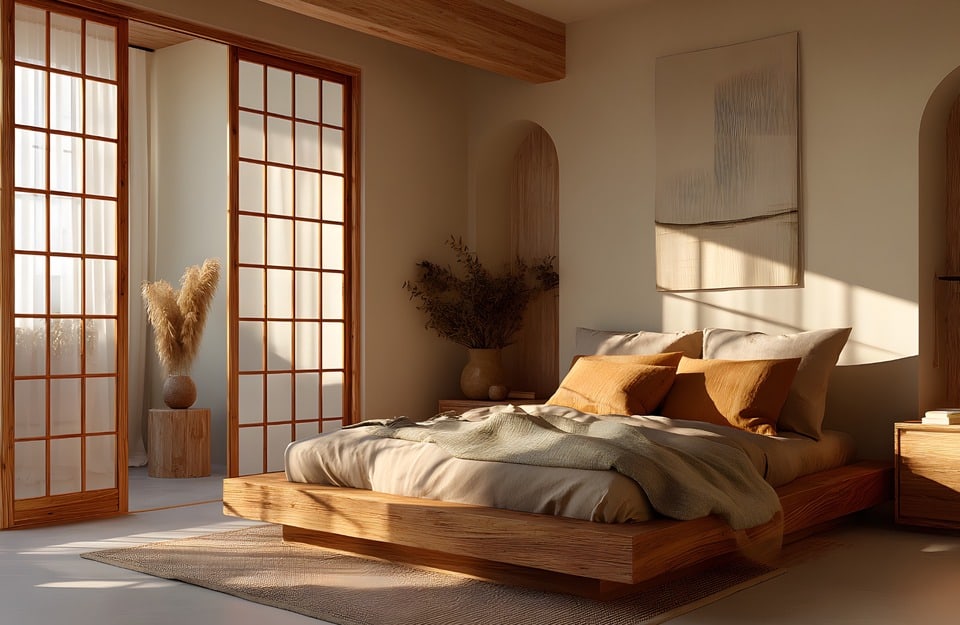
Wood in Japandi 2.0: grain, medium tones and authenticity
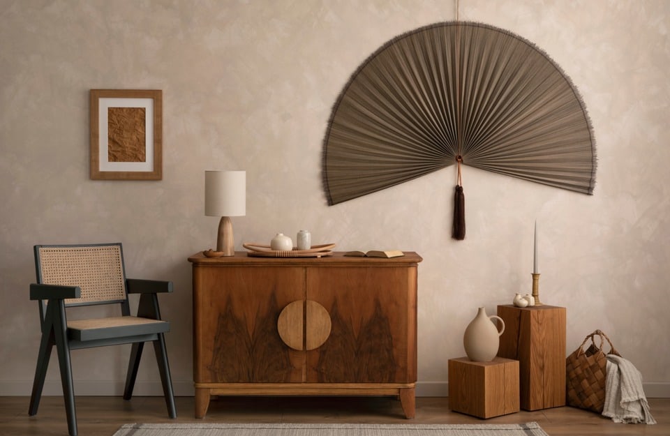
In Japandi 2.0, wood becomes narrative material and stops being just a “neutral” element. Surfaces should, in some way, tell the story of time and everyday use.
That is why these work well:
- wood species with visible grain (oak, ash, light walnut);
- medium tones and warm-natural shades (less “optical white,” more “milky” or “honeyed”);
- matte finishes or low gloss (light should flow, not reflect).
The goal is to add depth: a wood wall, a storage unit, a light boiserie, an important shelf. Even small interventions (tabletops, frames, interior doors) can change the atmosphere if consistent in finish.
That is why wood should not be treated with overly “plastic” products, otherwise the Japandi effect is lost. In Japandi 2.0, the ideal protection is the one that doesn’t steal the spotlight.
Materials and textures: the return of tactility
The subtlest but perhaps most important difference is sensory. Japandi 2.0 focuses on tactility: surfaces meant to be touched, not only photographed. It is a change of paradigm: the style becomes less “graphic” and more “material.”
Materials and textures consistent with Japandi 2.0:
- natural and textured fabrics (linen, heavy cotton, bouclé wool);
- matte ceramics, irregular glazes, “chalky” finishes;
- stone, stone-effect porcelain tiles, microcement (always in warm tones);
- metals used carefully (matte black, burnished bronze, satin details).
A practical rule: combine a calm base (neutral palette) with 2–3 recognizable materials. Too much uniformity makes the space flat; too many different textures make it confusing: Japandi 2.0 lives in the middle.
Finishes and surfaces: matte, natural, non-film-forming
In Japandi 2.0, the right finish is often the one that “disappears.” Preferred surfaces are:
- matte or extremely low gloss;
- silky to the eye (and, when possible, to the touch);
- with a natural effect, without visible thickness.
Why? Because light must remain soft and continuous, without harsh reflections. And because wood must look authentic, not “frozen” under a film that is too evident.
Japandi 2.0 and healthy homes: indoor air quality and conscious choices
Japandi 2.0 is also a form of “responsible design.” It is not just aesthetics: it is a way of thinking about the home as a place that should make you feel good, especially over time. And here two often underestimated aspects come into play:
- durability: materials and finishes that reduce the need for frequent replacements;
- healthiness: attention to what we introduce into interiors, especially indoors.
When working on wood (furniture, doors, boiserie, surfaces), choosing suitable indoor finishing systems means protecting not only the object but also domestic comfort. In Japandi 2.0, this coherence is part of the project: the home should not only “look calm,” it should also be calm, in its materials and technical choices.
How to achieve a Japandi 2.0 look: practical room-by-room guidelines
Here is a quick (but concrete) guide to translating the Japandi 2.0 concept into operational choices. The goal is not to copy an image, but to create a coherent system.
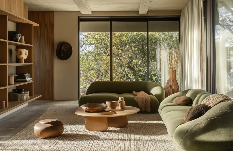
Living room
- Warm neutral base (greige/taupe) + medium wood
- 1 dominant material element (wood wall, important furniture piece, textured rug)
- Measured contrasts: matte black on details (lamps, handles, profiles)
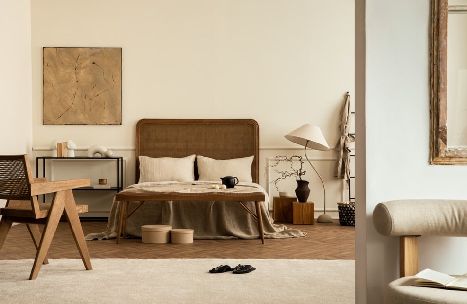
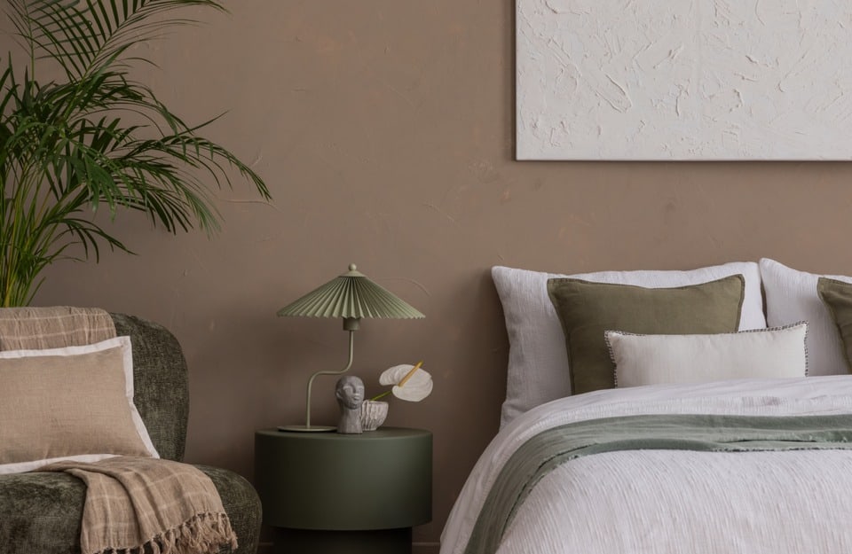
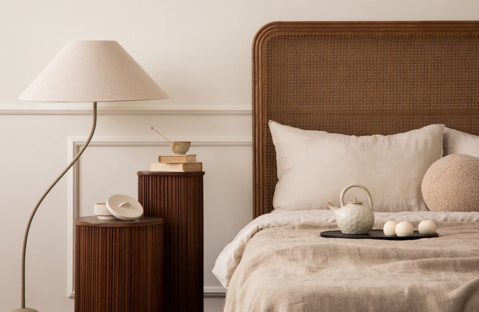
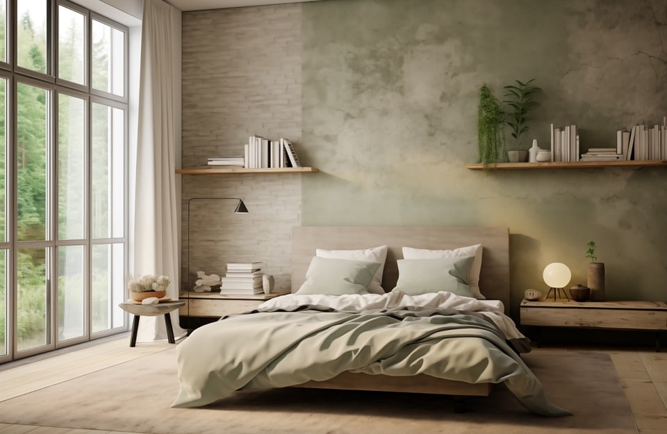
Bedroom
- Deeper and more enveloping palette (dark beige, taupe, warm grey)
- Layered but sober textiles (linen, wool, heavy cotton)
- Matte surfaces, soft lighting: “cocooning” is central in Japandi 2.0
Kitchen
- Wood as the main character on cabinet fronts, shelves or table (avoid overly glossy finishes)
- Stone/porcelain in warm tones, fine texture
- Reduced and curated accessories: few objects, but beautiful and coherent
Entryway and hallways
- Chromatic continuity: same neutral family as the living area
- Resistant and easy-to-clean surfaces
- Micro-contrasts: a medium-dark wood bench can “anchor” the space
Rio Verde products for the Japandi 2.0 style
In Japandi 2.0, wood and surfaces are active parts of the project. Choosing the right products directly impacts the final atmosphere: naturalness, material depth and visual comfort also depend on the type of system and finish used.
Enhancing wood while keeping a natural and matte appearance
When the goal is to protect wood without altering its appearance, Japandi 2.0 favors discreet, non-film-forming finishes that can accompany the material over time.
A coherent solution is Finitura Effetto Naturale RO 3000, ideal for interior furniture, boiserie, shelves, tables and surfaces where you want to maintain a matte, silky and authentic look.
Vintage Prestige: when Japandi 2.0 interacts with materiality
In this style, Vintage Prestige should not be intended as a decorative tool in the classic sense, but as a way to work on controlled materiality. It is particularly suitable for projects where wood or surfaces need to gain visual depth without losing sobriety.
Coherent uses:
- subtle decorative paneling;
- cabinet fronts or sideboards;
- secondary architectural elements (niches, side walls, back panels).
Vintage Prestige colors particularly suitable for Japandi 2.0 are:
- Cocco and Vaniglia for light bases that are not cold
- Nocciola and Marzapane for warm and enveloping tones
- Tartufo for deeper and more material accents
Evolution: continuous surfaces and chromatic coherence
The Evolution line fits when the project requires visual continuity and homogeneous surfaces, especially on elements that should not compete with wood but rather accompany it.
It is recommended for:
- interior doors;
- matte lacquered boiserie;
- fixed or custom-made furniture.
Evolution colors consistent with this style are:
- Seta (warm white, perfect for walls/doors in a soft key);
- Lino (warm neutral, great for continuity and cocooning);
- Cashmere (sophisticated greige for elegant and discreet backgrounds);
- Avana (warm medium tone, very Japandi 2.0 on boiserie and furniture);
- Salvia (desaturated green, natural and calming, to be used on one key furnishing element);
- Cacao (deep brown for measured and “grounded” accents);
- Ardesia (warm dark neutral, effective for controlled contrasts);
- Grafite (strong dark shade for details, profiles and small elements);
- Alloro (natural dark green, to be used as a very contained “forest” accent).
Exterior stains and systems: continuity between indoor and outdoor
In Japandi 2.0, outdoor spaces also dialogue with the interior. For pergolas, sunshades, cladding or small wooden furniture, systems that protect without creating visible peeling are recommended.
In this sense, Hybrid Resolve RS 80xx (natural effect, simplified maintenance) and Rio Verde impregnating stains (to set the wood tone and protect it) are coherent choices.
Floors or highly stressed surfaces in neutral, material tones
When the Japandi 2.0 palette works with taupe, warm greys and mineral tones, some continuous surfaces can also be part of the project, with Finitura per Parquet RP 2260 matte transparent (if the goal is protection and wear resistance on wood).
A key rule for Japandi 2.0
Regardless of the product chosen, the design logic remains the same: few surfaces, treated well, with finishes consistent with each other. In Japandi 2.0, the quality of the final result comes from the balance between material, color and protection. No “special effects”!
Mistakes to avoid in Japandi 2.0
To achieve a credible result, here is what to pay attention to:
- too much uniformity: only light neutrals and smooth surfaces risk a flat effect (and “old Japandi”);
- too harsh contrasts: matte black and optical white together can cool down the space;
- overly glossy finishes: light becomes sharp and material loses authenticity;
- random mix of textures: better a few recognizable materials, well balanced;
- unnecessary decorative objects: in Japandi 2.0 every element should have a function or meaning.
