Shades and pairings that turn the home into a place of well-being
Walking into a room and immediately feeling welcomed, relaxed, or stimulated isn’t a matter of expensive furnishings or elaborate shapes: it’s color that triggers the first, instant emotional reaction. In 2026 this awareness takes center stage.
Color is no longer just decoration, but a true tool for well-being. People are looking for hues that can support the rhythms of everyday life: shades that soothe when needed, spark creativity, infuse energy or, conversely, foster focus and rest.
Palettes therefore become more layered. Painting a wall isn’t enough to follow a trend: what matters is building a space with coherence and depth. Warm neutrals, for example, become the reassuring base on which to place emotional accents; botanical greens bring nature back indoors with a fresh elegance; mineral blues create contemplative spaces that help recharge. All this without forgetting textures: a matte finish, a grained wood, a metallic detail can radically change the perception of space.
Unmissable 2026 emerging trends
Alongside established themes—warm neutrals, natural greens, emotional blues—2026 introduces new nuances that enrich the interior design palette. Standing out is the balanced neutral, a soft sand-khaki that blends simplicity and refinement, adapting to different contexts without ever feeling bland.
Also very current is soft color drenching: furnishing a space with multiple variants of the same color, expressed through different materials and textures, to create an immersive, harmonious effect. Other novelties come from unusual pastels and softened violets, such as lavender and wisteria, perfect as fresh, surprising accents.
Natural colors evolve in a soft-Tech key—more filtered and luminous—meant to dialogue with modern materials like concrete and satin metals. Finally, the use of oxidized bronze, almost black, grows as a refined alternative to pure black for focal walls or furniture details, adding warmth and depth.

Evolved warm neutrals
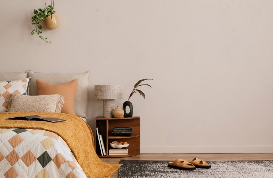
2026 marks the end of cold grays and sterile whites: neutrals return as protagonists—warmer and richer. Sand, greige, clay and soft khaki conjure earth and natural materials, giving interiors a sense of continuity and harmony. These hues don’t impose; they accompany, creating a kind of “visual embrace.”
These warm neutrals adapt to different styles. In minimalist settings they avoid chilliness, while in more classic rooms they lighten boiserie and important furnishings. They also work well in contemporary styles such as Japandi and within slow living, where natural matter and soft palettes are central.
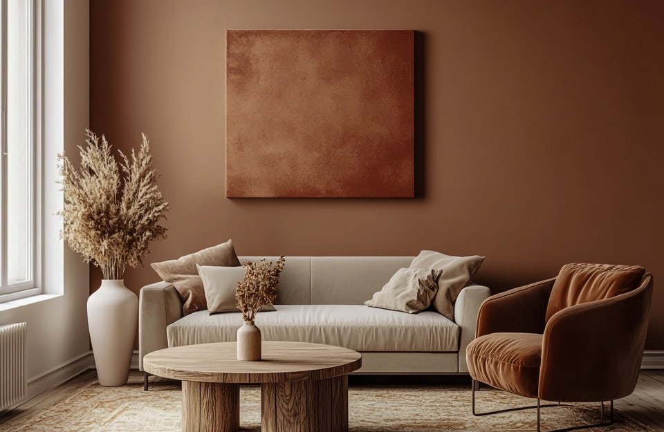
Deep, enveloping browns
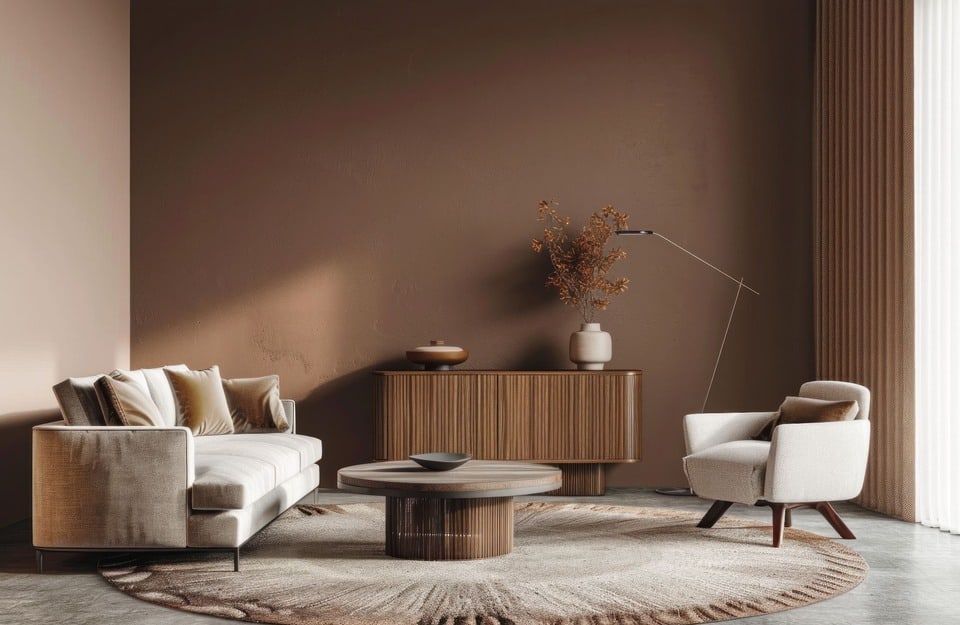
Among the colors that will define 2026 is brown, reinterpreted in an elegant, embracing key. We’re no longer talking about flat, heavy shades, but rich nuances ranging from cocoa to tobacco to worn leather. These colors convey security and roots, bringing warmth to interiors without looking gloomy—provided they’re well balanced.
The secret is equilibrium: used on an accent wall, on boiserie or on key pieces, deep browns gain timeless charm, especially paired with light textiles and warm lighting. They also work well with metallic details, which enhance their depth.
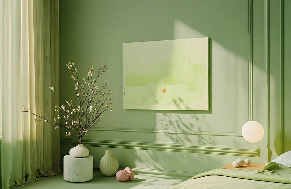
Botanical, regenerating greens
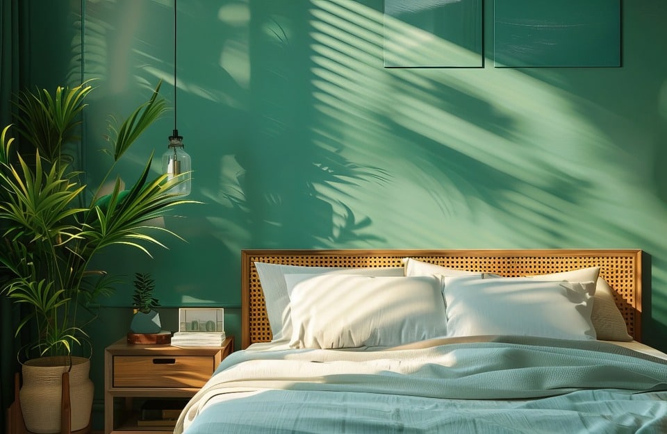
Green remains a leading player in 2026, but evolves into softer, more sophisticated forms. It’s not just intense forest greens anymore, but filtered tones with gray or neutral undertones that make them more balanced and contemporary.
They instantly bring a sense of nature indoors without excess rusticity: they evoke leaves, mosses and landscapes—with a modern touch.
In bedrooms or studies they encourage focus and calm, while in kitchens they add a convivial, authentic note. Paired with warm whites and natural materials like linen and light wood, they create regenerating, welcoming spaces.
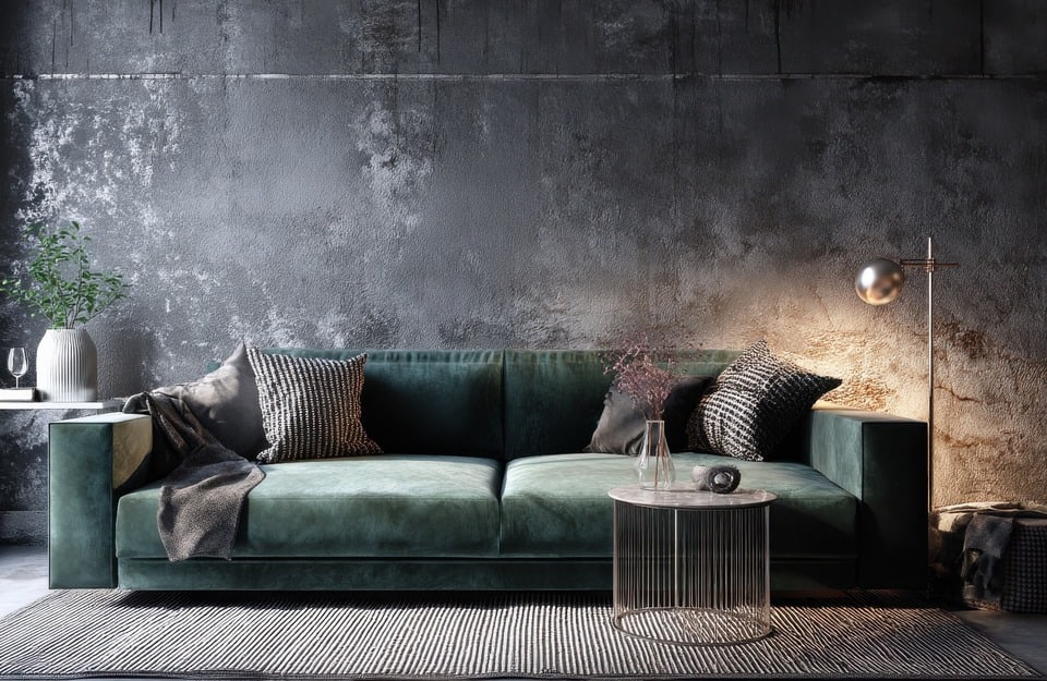
Emotional blues
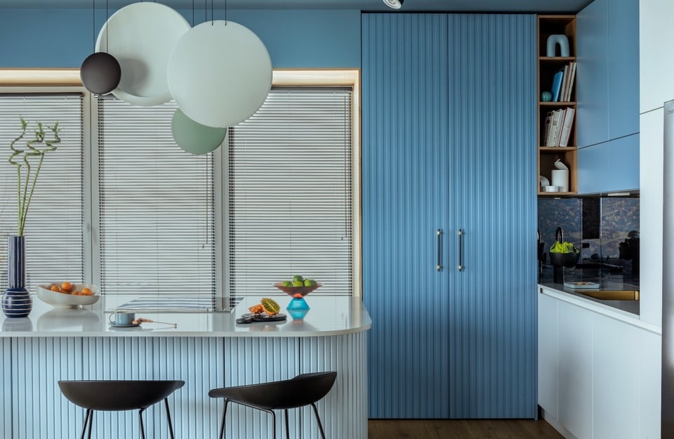
The blue of 2026 is no longer icy or overly austere; it appears mineral and velvety, evoking introspection and calm. It’s a hue that works well in rooms dedicated to relaxation, such as bedrooms or studies, because it helps unwind the mind and focus. The key is to dose it judiciously and pair it with warm lighting, which enhances its depth without making it too dark.
One of the most interesting trends is color drenching: playing with different shades of the same blue within one space—from walls to furnishings—to create an immersive, harmonious effect.
Spiced, gourmand and unexpected accents
The coming year will confirm the appeal of warm, spicy colors such as terracotta, ochre, paprika and amarena, while introducing new players: lavender, wisteria and muted antique reds.
Use these hues sparingly, yet they can ignite a neutral-dominated space, instantly adding character and originality.
Whether on a piece of furniture, a niche, or a frame, these accents stand out without becoming intrusive.
Textural whites
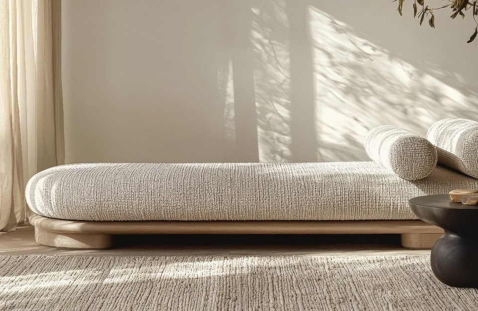
White remains a central color, but no longer in its cold, impersonal declinations. Instead, it favors more textural variants with cream, milk and ivory undertones that reflect light warmly and invitingly. This kind of white makes even small or dim spaces more livable, giving a sense of openness and serenity.
Perfect for ceilings, hallways or boiserie, textural white enhances both minimalist and classic interiors.
Metal effects and precious reflections
Luxury without excess, but through precious, refined details. Gold, copper, bronze and even almost-black oxidized tones find their place indoors—not only in small details like handles and mirrors, but also on focal walls that replace pure black. The result is a sophisticated atmosphere, rich in luminous vibrations yet never ostentatious.
The Golden Prestige range by Rio Verde perfectly interprets this trend, enriching furniture, architectural details or decorative inserts and transforming an ordinary space into something unique and curated.
How to apply 2026 colors room by room
Here are some ideas for pairing wall colors with Rio Verde finishes.
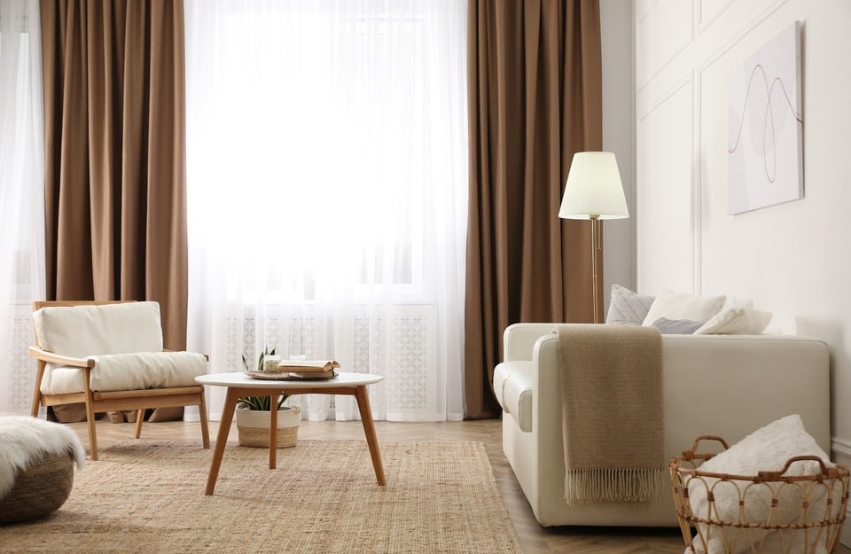
Living room
- Walls: warm neutral (sand/taupe).
- Furniture and boiserie: Vintage Prestige Nocciola (RB 1290) or Marzapane (RB 1990) for soft warmth; alternatively Evolution (within warm neutrals) for a more contemporary, uniform effect.
- Open-pore wood (indoor): Impregnante Ceroso water-based RC1x30 to highlight the grain with a textural feel.
- Floor: Floor Prestige Tortora (RB 2070) for visual continuity with the walls.
- Precious details: Golden Prestige Oro Bruno (RB 5090) on handles, frames or trim.
Bedroom
- Walls: filtered greens (soft olive/moss) to foster calm.
- Wardrobes and headboard: Vintage Prestige Ginepro (RB 1790) or Tartufo (RB 1890); for a silky, full look, Evolution (warm neutrals or muted greens).
- Visible wood (indoor): Impregnante Gel water-based RGxx80 (drip-resistant on verticals), finished with a water-based clear coat.
- Floor: Floor Prestige Papiro (RB 2170) to maximize brightness and softness.
- Metal accents: Golden Prestige Oro Bianco (RB 5390) on small accessories.
Kitchen
- Walls: warm white/ivory to expand the space.
- Doors and tall units: Vintage Prestige Amarena (RB 1090) for a “gourmand” touch, or Marzapane (RB 1990) for soft elegance; a more “urban” alternative with Evolution (creamy or warm-gray tones).
- Wood table and snack tops: opaque finish Evolution (warm neutrals) for uniformity and easy care; to reveal the grain, an Impregnante Ceroso + clear finish.
- Floor: Floor Prestige Cemento (RB 2270) or Piombo (RB 2370) for character and durability.
- Light details: Golden Prestige Oro Bianco (RB 5390) on trims and frames.
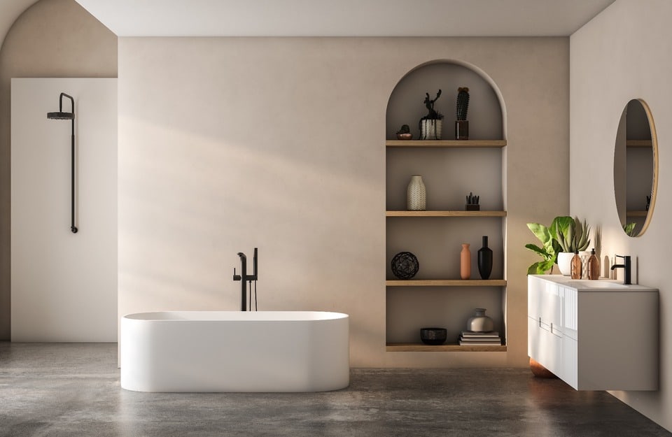
Bathroom
- Walls: deep blue/blue-gray for a contemplative mood.
- Vanity and wall units: Vintage Prestige Vaniglia (RB 1390) or Frappè (RB 1190) for luminous contrast; Evolution (warm grays) for a more essential look.
- Wood elements not exposed to water: Impregnante Classico water-based RMxx10 followed by a water-based clear finish.
- Floor: Floor Prestige Piombo (RB 2370) for chromatic depth.
- Metal inserts: Golden Prestige Oro Bianco (RB 5390) on mirror frames and small details.
Study
- Walls: warm gray/anthracite for focus and poise.
- Desk and bookcases: Vintage Prestige Nocciola (RB 1290) or Tartufo (RB 1890); for a full, even surface, Evolution (warm grays or taupe).
- Open-pore wood parts: Impregnante Gel water-based RGxx80 for natural tactility on vertical elements.
- Floor: Floor Prestige Antracite (RB 2470) to convey authority.
- Accents: Golden Prestige Oro Nero (RB 5490) on small hardware and trims.
Entrance
- Walls: ivory white to amplify light and order.
- Console, benches, frames: Vintage Prestige Frappè (RB 1190) or Evolution (beige/greige) for a clean, welcoming effect.
- Natural wood (indoor): Impregnante Ceroso water-based RC1x30 to enhance the grain with a silky touch.
- Floor: Floor Prestige Papiro (RB 2170) or Cemento (RB 2270) for durability and chromatic continuity.
- Signature detail: Golden Prestige Oro Bruno (RB 5090) on hooks, nameplates or fine trim.
