Generation Z’s preferred aesthetic styles and tastes: a complete guide with ideas and Rio Verde products to use
If there is one trait that distinguishes Generation Z from the generations that came before it—at least in the way living spaces are inhabited—it is the freedom with which it approaches interior design. For those born between the late 1990s and the early 2010s, furnishing is seen more as a personal language than as a “code” to be respected.
The point is not to “choose a style” and stay inside it, but to build a home that tells a story of identity, sensitivity, and change. A space that can be ironic and serious, nostalgic and futuristic, tidy and deliberately imperfect.
This flexibility comes from a visual imagination raised on social media—let’s not forget this is the first truly “digital native” generation. Between trends that shift quickly and moodboards that appear and disappear during endless scroll, aesthetics are absorbed fragment by fragment, recombining into mosaics that become real declarations of taste.
Index
- 1. Nostalgia Remix
- 2. Playful and bold color
- 3. Light wood, naturalness and visual well-being
- 4. Second-hand, vintage and found décor
- 5. Soft shapes and fluid lines
- 6. Anti-design, imperfection and personalization
- 7. Emotional minimalism
- 8. Core-style aesthetics
- 9. Biophilia and enhanced domestic nature
- 10. Tech-integrated living
- 11. Modular and flexible micro-spaces
- 12. Quiet luxury / Soft luxury
- 13. Retro-futurism
- 14. Kawaii-soft / Pastel dream
- 15. Art-driven interior
- 16. Ethical-global mix
- 17. Sensory design
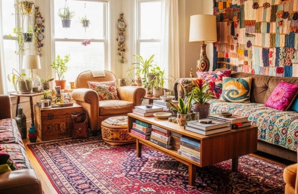
1. Nostalgia Remix
For Generation Z, nostalgia is not a conservative refuge, a return to “the way things used to be”: it’s a conscious remix, a fluid language. References to the ’60s–’70s or the early 2000s are never total, but appear through individual objects or surfaces that become carriers of visual memory.
The result does not aim for philological coherence, but for emotional coherence: objects are chosen that activate memory and comfort, updating them through contemporary contrasts.
In this style, wood is often present, but not in a “brand-new” version: lived-in surfaces, tables, sideboards, recovered chairs. This is where Rio Verde wood stains come into play, ideal for reviving the material without erasing its history.
On these supports, Vintage Prestige can intervene selectively (doors, sides, details), while Golden Prestige becomes a retro-glam accent on secondary elements. The result is a credible remix: not a “themed” room, but a layered environment where the past converses with the present.

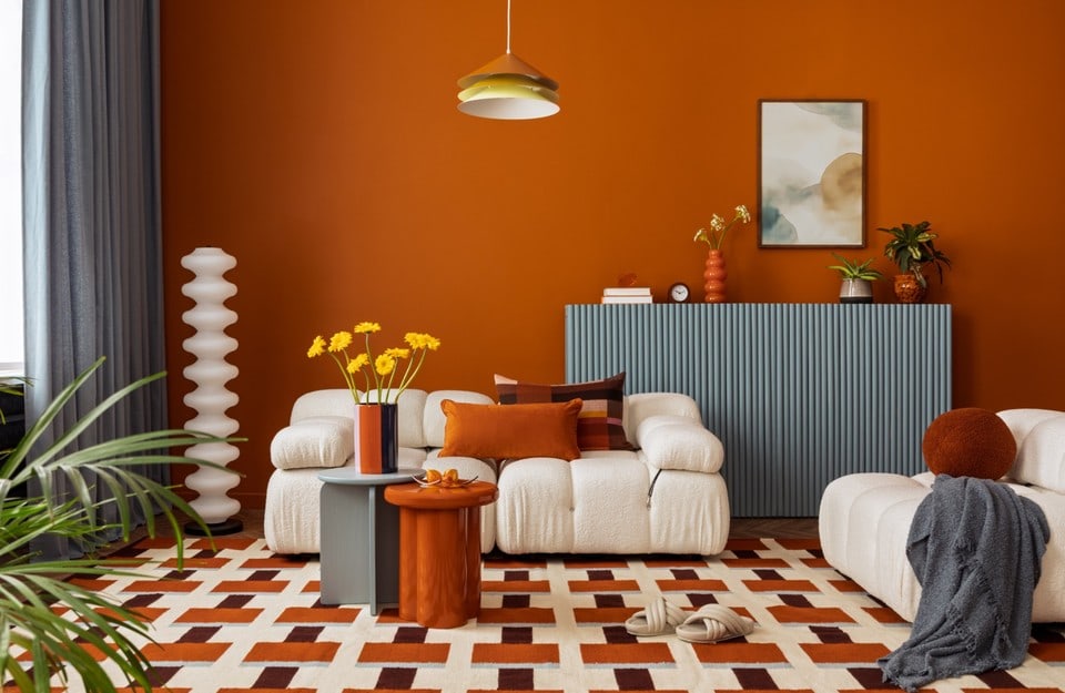
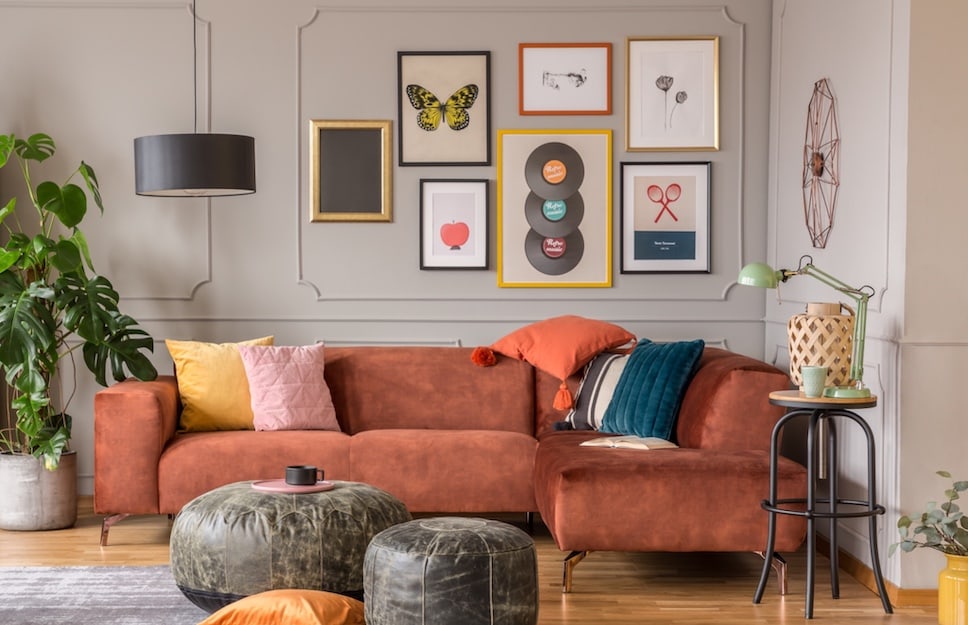
2. Playful and bold color
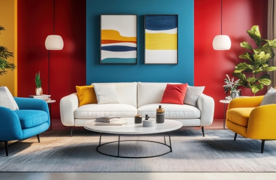
After years dominated by neutrality, Generation Z brings color back to the center of the project. Not as a simple “accent wall,” but as an emotional tool: color becomes energy, identity, mood. Contrasts are often sharp (in the spirit of color blocking), shades are saturated, and the chromatic play doesn’t fear bold moves. It’s an aesthetic fueled by a need to stand out instantly: a room has to “say something” at first glance, even in photographs.
To achieve a convincing result, it’s best to avoid colors that are too muted or “uncertain” and aim for readable pairings: a calm base (papyrus, cream, greige) and a push element (cobalt blue, full green, yellow). Here Vintage Prestige is a very effective tool because it combines coverage and materiality: the color looks denser, more present, less “flat.” Golden Prestige can instead come in as a micro-contrast: a metallic detail that adds rhythm, especially if the room already has many hues and needs a controlled point of light.
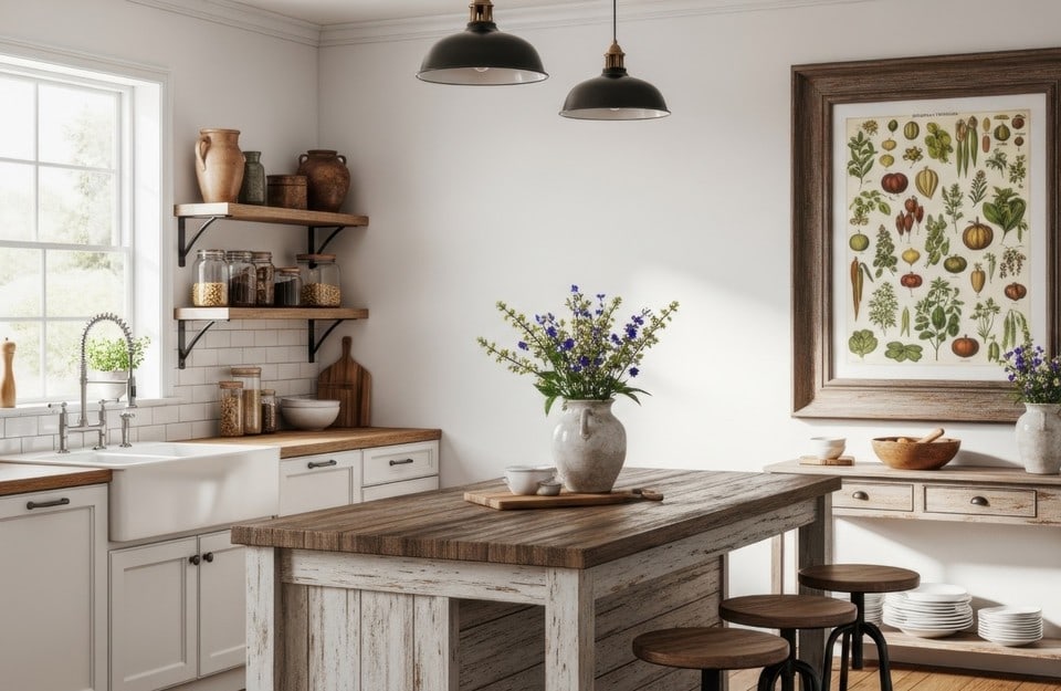
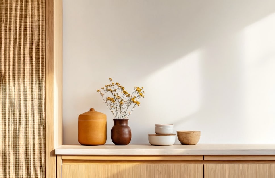
3. Light wood, naturalness and visual well-being
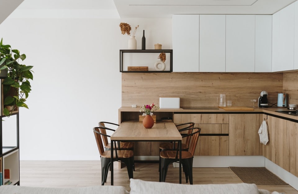
Light wood is central because it responds to a need for light, calm and authenticity. But for Gen Z it’s not enough for it to “be wood”: what matters is how it’s treated. Surfaces that are too glossy or artificial are often rejected in favor of matte, tactile, natural finishes.
In this scenario, wood stains are fundamental tools: they protect the wood, even out its look and enhance the grain without creating obvious films. Impregnante Ceroso, in particular, aligns with the soft-touch aesthetic and the idea of a “living” surface.
When the project requires greater resistance (tabletops, heavily used surfaces), Evolution is a balanced solution: high performance, but a sober visual result, suitable for bright and minimal interiors. The idea is not to make the material “disappear,” but to support it in real daily use.
To even out a surface or lighten the impact of a dark floor, finally, Floor Prestige can become an ally: it’s a paint designed for floors and enables an aesthetic and functional refresh in line with Gen Z’s request for bright, matte and contemporary environments. The idea is simple: reduce visual noise, increase light, maintain a “material” contact with the space.
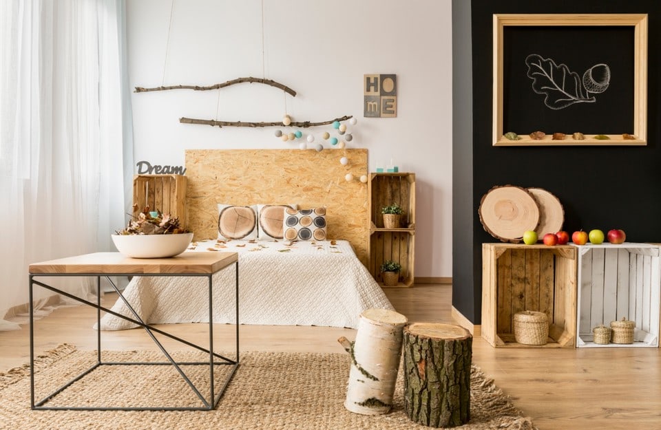
4. Second-hand, vintage and found décor
Reuse is one of the pillars of Gen Z aesthetics. Not only for economic or environmental reasons, but because second-hand pieces are perceived as a guarantee of uniqueness. Recovered objects and furniture become narrative supports, to be reinterpreted without erasing their lived-in character.
Here, painting is never just decoration, but a design act.
Rio Verde wood stains are ideal when you want to keep the wood material “readable,” improving its look and durability.
The paint Evolution is perfect when the goal is to refresh a surface with a contemporary look, yet resistant to daily use: chairs, tables, worktops, surfaces used with a certain frequency.
Vintage Prestige instead allows a radical transformation of a piece of furniture, delivering a matte, material effect that communicates aesthetic intention and turns even a “tired” piece into a contemporary object.
This combination allows Gen Z to work in stages: preserve, correct, transform—without ever losing the original character of the object.
5. Soft shapes and fluid lines
Visual comfort is a must: curved sofas, organic coffee tables, wavy mirrors, mushroom or bubble lamps. It’s a reaction to overly rigid and “technical” languages that dominated in other periods: the space must welcome, not impose. Fluid lines also have a practical advantage: they make the environment softer in photos and less “sharp” in everyday life.
To support this style, surface finishing should avoid harsh reflections and aim for matte and texture. Here Vintage Prestige works well because it enhances volume: on a curved surface, the material creates vibrations and depth.
Golden Prestige can instead be used as a graphic detail: an edge, a base, a feature that catches light and accentuates curves without overloading the whole. The goal, in short, is to make the space feel “soft” even when materials are solid.
6. Anti-design, imperfection and personalization
A significant part of this generation’s aesthetic rejects the idea of a perfect, glossy home. So-called anti-design celebrates imperfection: marks, layering, non-canonical combinations, customized pieces, DIY interventions. This is not neglect: it’s a conscious choice that turns “mistake” into language. In this style, the home is a process, not a definitive result.
Practically, painting becomes an expressive tool: not only covering, but creating textures, traces, effects. Vintage Prestige fits this approach because it allows techniques that leave a visible imprint (sponge, roller, visible brushstrokes) and makes color feel more “alive.”
If the imperfection concerns a large and worn surface, like a floor you want to restore to new readability, Floor Prestige helps even out and renew, keeping a matte look consistent with the anti-polished aesthetic.
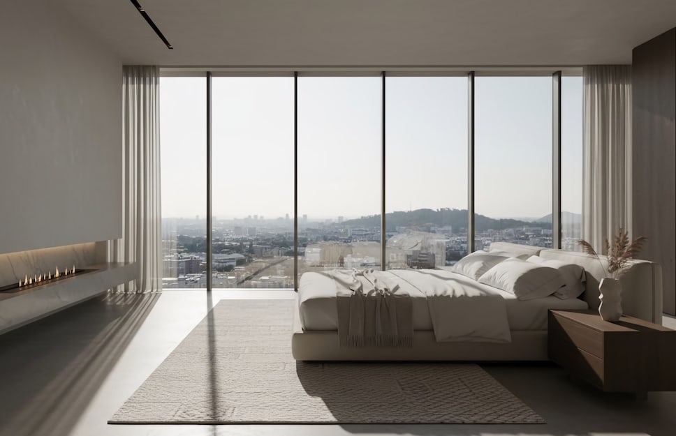
7. Emotional minimalism
Despite the push toward color and mixing, Generation Z often also seeks “breathing room” and tranquility. Hence the preference for warm minimalism: no showroom coldness, but essential environments with few elements, carefully chosen, and a neutral palette able to calm. It’s a style that works on sensations: soft light, natural materials, silky surfaces, absence of excess.
In this scenario, the role of finishes is decisive: too much gloss can make the room rigid; a well-managed matte, instead, makes it intimate. Floor Prestige, with its neutral nuances and matt result, can be interesting for floors that need to become a quiet base.
Vintage Prestige, used in delicate, dusty shades, makes it possible to renew a piece of furniture without introducing unwanted shine. The idea is to create a home that “holds up” even without strong stimuli: a quality Gen Z is reappraising.
8. Core-style aesthetics
“Aesthetics” are a generational grammar: weirdcore, dreamcore, cluttercore, cottagecore and many other visual micro-cultures. In these worlds, the home becomes a narrative set. There isn’t just one way to furnish: what matters is internal coherence with the micro-story you want to build. One corner can be surreal and playful; another more nostalgic; another full of objects and collages.
To make these aesthetics credible, you often need a strong “material” base: a wall or a piece of furniture that sets the tone. Vintage Prestige is suitable because it allows rich, recognizable blocks of color even on different surfaces (wood, metal, plastic, glass, fabric and small sections of wall). Also, the material finish supports the idea of a “hand-built” world.
Golden Prestige can be useful when the style calls for sparkles, unreal details, reflections: a controlled metallic accent is often what triggers the “aesthetic” effect without having to fill everything.
9. Biophilia and enhanced domestic nature
Biophilia isn’t just “putting plants at home,” but building an environment that communicates healthiness and connection to nature. Wood, in this sense, is a key material, especially if treated respectfully.
Rio Verde wood stains make it possible to protect wooden surfaces without altering their organic appearance, making them ideal for environments where plants, natural light and raw materials coexist.
Evolution can be used when more performance protection is needed (for example on surfaces exposed to humidity or intense use), while still keeping a sober aesthetic consistent with well-being.
In these interiors, color is often secondary: textures, natural tones and matte finishes prevail. Paint should not “stand out,” but contribute to the overall feeling of balance.
10. Tech-integrated living
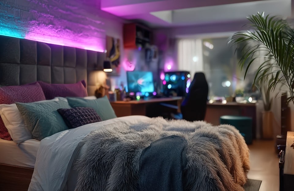
Tech-integrated living means integrating technology and interior design as part of the style: RGB lights, streaming setups, study-gaming corners, sound, home automation.
The home is an extension of digital life: it must support content, calls, creative production. This trend is highly visual: the room must work on video too, not only in person.
In this case, surfaces often serve as a “background” and must manage light and reflections. A matte base helps avoid annoying glare and makes the environment more controllable: Floor Prestige can be useful if the floor is too reflective or visually messy, because it makes it uniform and matt.
Vintage Prestige can define the portion of a wall or a piece of furniture that needs to “hold” colored lights and give character to the set. Golden Prestige, finally, is effective for micro-reflections: details that catch the light and add depth without turning the room into a permanent special effect.
11. Modular and flexible micro-spaces
Living in small, shared or temporary spaces is a common condition for younger generations. Flexibility becomes a necessity and, as a result, an aesthetic: lightweight, multifunctional furnishings that can be easily reconfigured. In these contexts, visual continuity is essential to avoid a chaotic effect.
The paint Evolution is especially suitable for this scenario: it offers resistance to daily use and a uniform look, ideal for furniture that is moved, touched and transformed.
Wood stains can be used to harmonize different wooden elements, creating a coherent chromatic base without weighing down the space.
The goal is not to create a “definitive” environment, but an adaptable space that can change with the life of the person living in it. Finishes, in this sense, become tools for visual simplification.
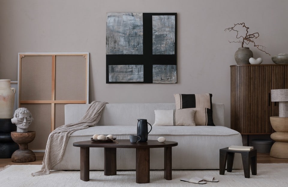
12. Quiet luxury / Soft luxury
Luxury, for this generation, tends to become “quiet”: not ostentation, but perceived quality. Rich textiles (bouclé, wools, matte velvets), sophisticated palettes (cream, taupe, sand), soft finishes and well-calibrated details. It’s an adult aesthetic, but not rigid: it seeks comfort, not formalism.
In this context Golden Prestige can play a precise role: a metallic accent on a few details (a frame, a base, a handle) communicates care and refinement without becoming baroque.
Vintage Prestige, in warmer and more neutral shades, can refresh a piece of furniture and make it instantly feel “high-end,” thanks to material depth and elegant opacity.
13. Retro-futurism
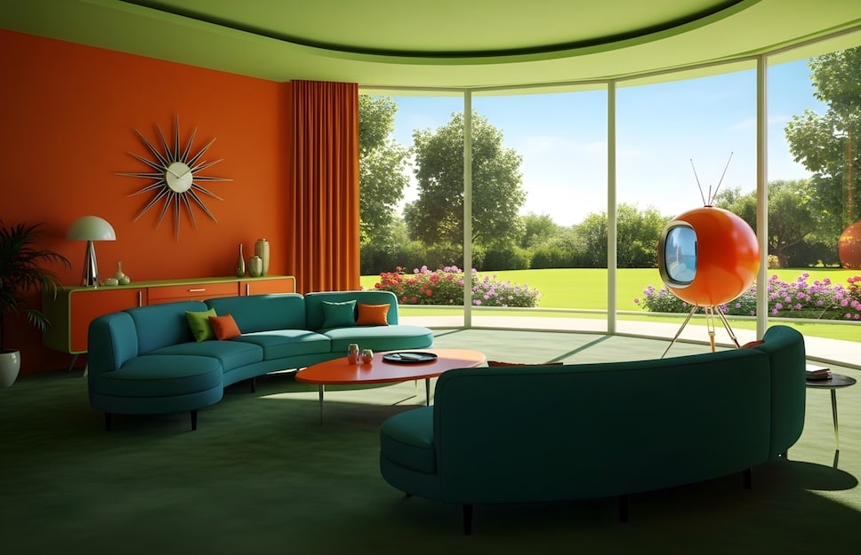
Retro-futurism combines “yesterday’s future” imaginaries (’70s, soft sci-fi, chrome) with contemporary digital sensibility. Glossy surfaces, colored transparencies, sculptural objects and details almost like a movie set. It’s a trend that works particularly well when one rule is kept: few objects, lots of character.
Golden Prestige is naturally consistent with this style: metallics (white gold, black gold, rose gold) can turn an ordinary detail into a futuristic element, especially when combined with controlled lighting.
Vintage Prestige can instead act as a matte, material base, creating contrast with metal: matte and glossy together make the room richer and more “designed.” Here too, restraint matters: a well-placed accent is more effective than widespread decoration.
14. Kawaii-soft / Pastel dream
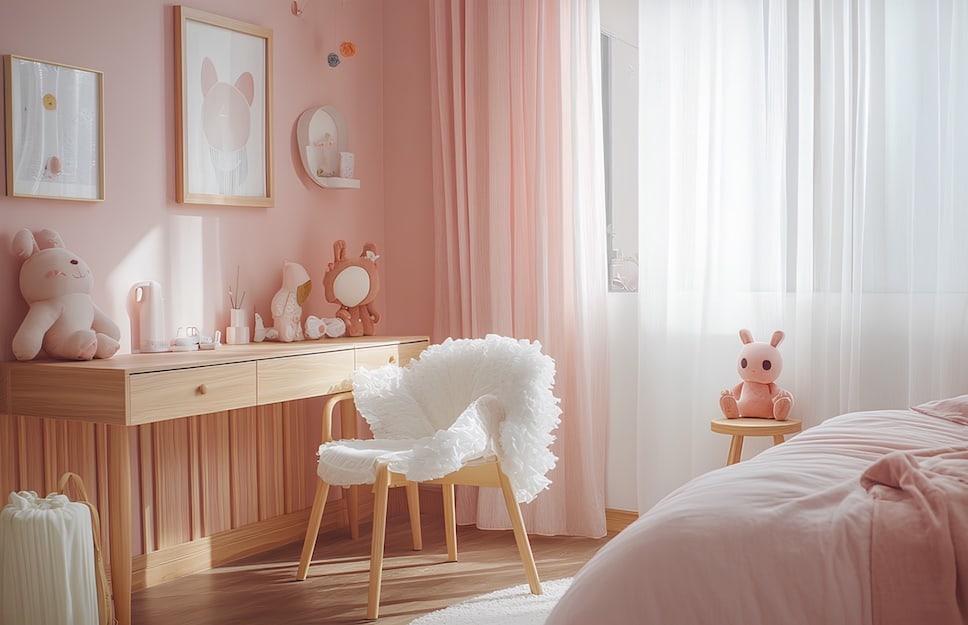
These are aesthetics influenced by Japanese and Korean culture: pastel tones, rounded shapes, “cute” objects, visual lightness. It’s a language that aims to create a reassuring, soft and joyful environment, often in response to stress and uncertainty. The home becomes a place to decompress.
To achieve this effect, surfaces must be consistent: matte finishes, sugary but not acidic colors, materials that give back comfort. Vintage Prestige is suitable because it enables pastel color fields with a soft, material result, ideal on small furniture and accessories.
Golden Prestige can come in discreetly (white gold or rose gold) on small details: the goal is not to “do luxury,” but to add a controlled sparkle that works like a visual accessory.
15. Art-driven interior
In many Gen Z interiors, art isn’t an add-on: it’s the center. Posters, prints, illustration, photography, self-produced objects, micro-installations. The home becomes a creative, communicative environment, often built through layers (gallery wall, narrative shelves, themed corners). The value here is the ability to tell your story: furnishing supports narration.
In this logic, surfaces must be able to “hold” art without competing in a chaotic way. A matte, coherent base helps a lot: Vintage Prestige can define a storage unit or a scenic element that counterbalances the prints.
Golden Prestige, used as a graphic detail (frames, small objects), can create points of light that enhance the composition without stealing the scene.
If the overall setup needs order, intervening on the floor with Floor Prestige can increase the legibility of the arrangement, reducing general visual noise.
16. Ethical-global mix
This style combines aesthetics and responsibility: handcrafted objects, traditional textiles, ceramics, natural materials and “honest” workmanship, chosen with attention to origin and impact. It’s a global mix that, in its most mature versions, avoids the souvenir effect and instead builds a dialogue between cultures and materials, with real attention to ethics.
To enhance this approach, surface finishing must respect the material and not make it artificial.
Where color is needed, Vintage Prestige can be used to refresh an element without erasing its identity, thanks to its matte and sophisticated result.
Golden Prestige can be introduced with restraint, as a precious detail that integrates into a material-driven whole. The key is to avoid excess: elegance comes from respecting the material and careful selection, not from accumulation.
17. Sensory design
Sensory design puts the physical experience of space at the center: texture, acoustics, light, visual and tactile comfort. It’s a growing trend because it responds to a concrete need: living in environments that regulate stress and improve focus and rest. In many cases, Gen Z chooses matte surfaces, soft materials, calming colors and adjustable lighting, reducing anything that disturbs.
In this framework, matte becomes a functional value as well as an aesthetic one.
Floor Prestige, with its matt and resistant performance, is useful when you want a beautiful floor that isn’t “active” (too many reflections, too much visual disorder).
Vintage Prestige, with its materiality, creates surfaces that feel warmer and more present, ideal for furniture that is touched and lived with.
Golden Prestige can be reserved for minimal details if you want a very controlled point of light: sensory design doesn’t exclude the accent, but uses it with discipline.
