Ivory is an elegant and versatile shade, perfect as a neutral base for different interior design palettes. Characterised by a slight yellowish or cream tinge, which distinguishes it from pure white, this shade gives a soft and natural feel. It is a perfect shade for those who want a bright but cosy ambience.
What colour is ivory white?
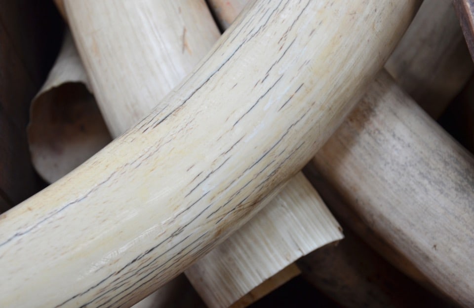
Ivory is a shade of white that tends slightly to yellow or beige. It is so called because it is reminiscent of the natural colour ofivory.
It is a warm and soft colour, widely used in interior design, fashion and decoration to create cosy and sophisticated environments.
It is also sometimes called ‘off-white’, although this (incorrect) definition can be used for several other shades of white.
How can ivory white be obtained?
In addition to the paints already available on the market (in the RAL classification, ivory corresponds to RAL 1014, while RAL 1015 is light ivory), ivory white can be obtained by mixing white paints with small amounts of yellow and brown paints until the desired shade is achieved.
For example, with the textured effect paints from our Vintage Prestige line, small amounts of Vanilla yellow or Hazelnut brown are added to a Fiordilatte white or Coconut white base.
[elementor-template id=”58700″]
What is the difference between beige and ivory? And between white and ivory?
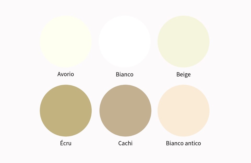
As already mentioned, ivory is a warm shade of white, with a yellow or cream undertone.
Antique white, on the other hand, has an undertone decidedly more on the brown side than ivory.
Beige is a light brown, darker and less luminous than ivory white, which instead belongs to the white nuances.
Khaki tends to yellow-green, and is darker.
Écru has a more noticeable beige or light brown undertone.
Choosing ivory as the primary white for interior design
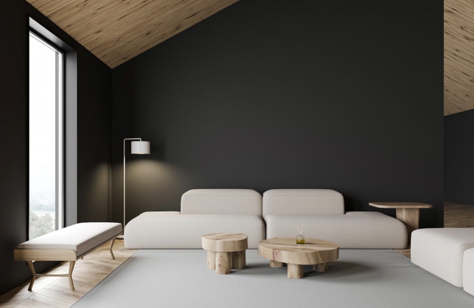
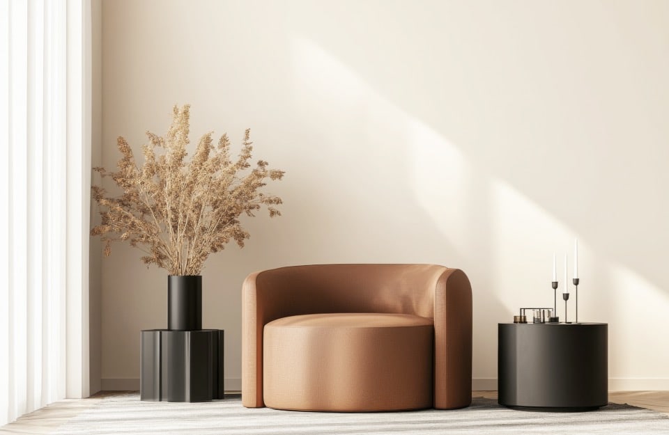
Ivory is a warm shade that conveys a sense of balance and tranquillity. Unlike pure white, which can be cold and impersonal, ivory gives depth to spaces and can easily be combined with other colours and many materials.
Given the colour trends for interior design, it goes very well with both the shades that have been on the crest of the wave for the past few years and the colours that are becoming more and more popular, from ‘sweet’ browns to terracotta, from butter yellow (perfect for a tone on tone with ivory) to important reds, from dusty blues and greens to deeper ones, from fresh teal to pastel purples and pinks.
Among its main benefits are:
-
- versatility: adapts to both classic and contemporary environments;
- natural lighting: reflects light and makes spaces brighter;
- elegant simplicity: gives a refined touch without being excessive.
Where to use ivory and what to watch out for
Ivory lends itself to many uses in interiors:
- walls: perfect for those seeking a neutral but welcoming ‘canvas’;
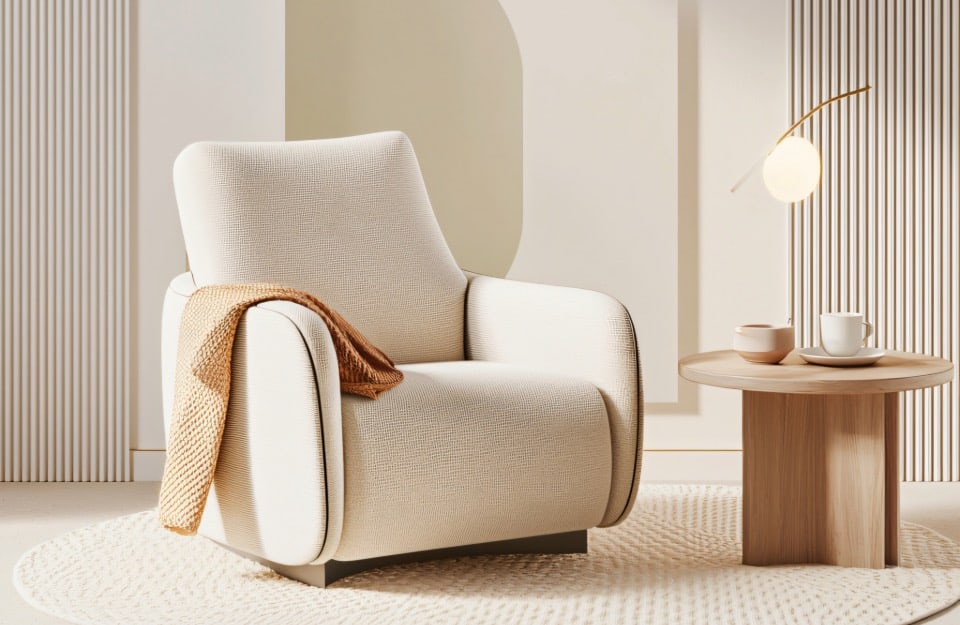
- furniture and furnishings: ivory armchairs, sofas and curtains add lightness to the room;
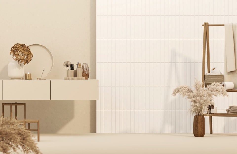
- kitchen and bathroom: ivory tiles, furniture and details add elegance and brightness;
- fabrics and accessories: ivory carpets, cushions and bed linen create a sense of continuity and harmony.
However, care must be taken to use this colour well as it can be flat if used in excess. Especially in the case of tone-on-tone combinations, it is better to combine it with different textures and materials.
Pay attention to the lighting too: artificial light can alter the perception, making this colour appear more yellow or greyish.
How to match ivory white?
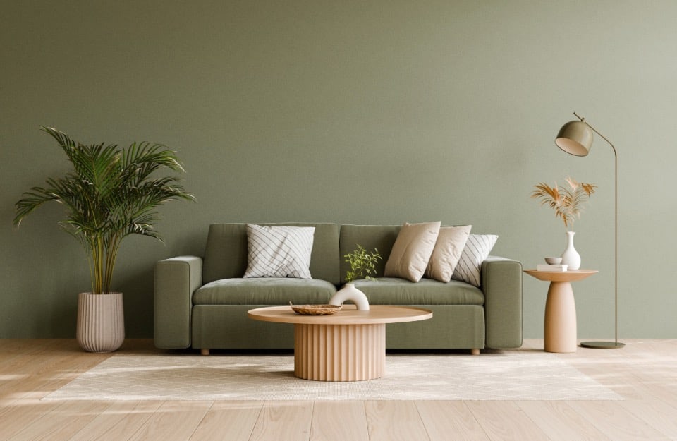
- With an earthy and natural palette: together with colours such as terracotta, light beige, warm brown, olive green.
Ivory white serves as a bright base, while earth tones add depth and warmth. It is ideal for the living room, bedroom, kitchen and study. It goes well with materials such as natural wood (light or medium), linen, cotton, handmade ceramics, wicker, jute and the use of green plants. - Aim for sophisticated discretion: with light grey, powder pink, powder blue and golden accents (for the latter, Golden Prestige paint can be used on all surfaces).
- Ivory and light grey maintain the brightness, while powder pink and powder blue add a touch of soft, sophisticated colour. Finally, gold accents add a touch of discreet luxury. This combination is recommended in the bedroom, living room, dining room and bathroom.
- For a fresh and bright combination: with sage green, sky blue, pastel yellow (e.g. Vanilla by Vintage Prestige) and light wood.
Ivory white maximises brightness, while sage green, sky blue and pastel yellow add delicate and refreshing touches of colour. Light wood contributes to a natural and cosy atmosphere. For kitchen, bathroom, bedroom, study and entrance. - Towards a warm minimalism: together with anthracite grey, black, dark beige and dark wood accents.
Ivory white and black create an elegant and bold contrast, while anthracite grey and warm beige soften the rigidity and add depth. Dark wood introduces a natural and warm element. The most suitable rooms are the living room, office, kitchen and dining room. Materials include concrete, black metal, glass, leather, wool and technical fabrics.