Guide to the Most Elegant Shades for Decorating
In recent years, natural tones have been the undisputed stars of interiors. Brown, in particular, has shaken off the label of a “old-fashioned color” to speak the language of contemporary design once again. It’s the color of earth, bark and, above all, wood: it evokes stability, roots, and protection.
In uncertain times, we take refuge in colors that feel like home, like something real. And brown — in all its shades — is exactly that: an invitation to warmth, to feeling good in your own spaces.
All the Shades of Brown: from Nature to Interiors

Brown isn’t just one color. In fact, its strength lies in its variety. There’s light brown, like hazelnut (which is among the colors of Rio Verde’s Vintage Prestige line) or caramel, perfect for bright, relaxing spaces. There are medium browns — such as chestnut or coffee — that create atmosphere. And then the dark browns, intense and enveloping, like dark walnut or mocha.
Another major difference to consider is between warm browns (with red or orange undertones, like chocolate or tobacco) and cool browns (closer to gray or green, like olive brown or grayish brown).
Color temperature deeply influences the perception of a room: a warm brown welcomes, a cool brown soothes and clears.
The Most Well-Known and Used Brown Tones

- Walnut: intense and refined, with warm nuances. Perfect for wainscoting, classic furniture, and elegant spaces. It’s one of the most iconic shades in wood finishing. Not by chance, you’ll find it in Rio Verde’s wood stains lines.
- Chestnut: a medium brown, slightly reddish. Versatile and welcoming, it fits rustic kitchens, chalets, and natural settings. Here too, it’s one of the flagship tones of our wood stains.
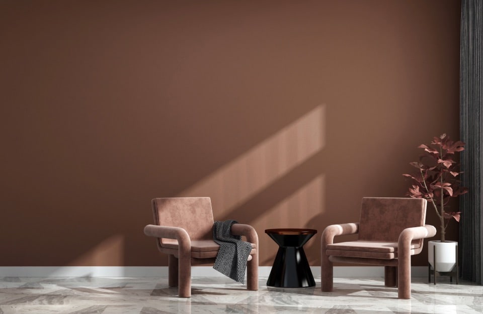
- Coffee: full and bold, reminiscent of roasted coffee aroma. It adds depth to spaces and is ideal for decorative details and accent walls. It’s close to Pantone’s Color of the Year 2025, Mocha Mousse.
- Chocolate: dense, creamy, enveloping. Much loved in “cozy” interiors or modern living rooms with industrial touches.
- Tobacco: with a vintage, slightly dusty soul. Perfect for retro-style rooms or spaces with a bohemian vibe.
- Caramel: luminous, soft, with a golden cast. Pairs well with beige and sand for a sophisticated, relaxing effect.
- Leather: warm and natural, it evokes the artisanal world. Widely used in masculine interiors, lofts, and tactile, authentic spaces.
- Mocha: a deep brown verging on black, extremely elegant. Used for minimal and dramatic spaces.
- Warm taupe: halfway between brown and gray, with a rosy note. Refined and modern, often used as the “new neutral.”
- Cinnamon: spicy and vibrant, with orangey undertones. Ideal for bringing warmth to Mediterranean or eclectic homes.
- Dark greige: a sophisticated mix of brown and gray. It suits the “Organic Modern” style and natural, velvety palettes.
- Olive brown: elegant and “earthy,” with green reflections that evoke woodland landscapes. Great with raw woods and linen or jute fabrics.
How to Combine Brown: Winning Pairings

Brown is an excellent “supporting actor” for other colors.
Here are some combinations that always work:
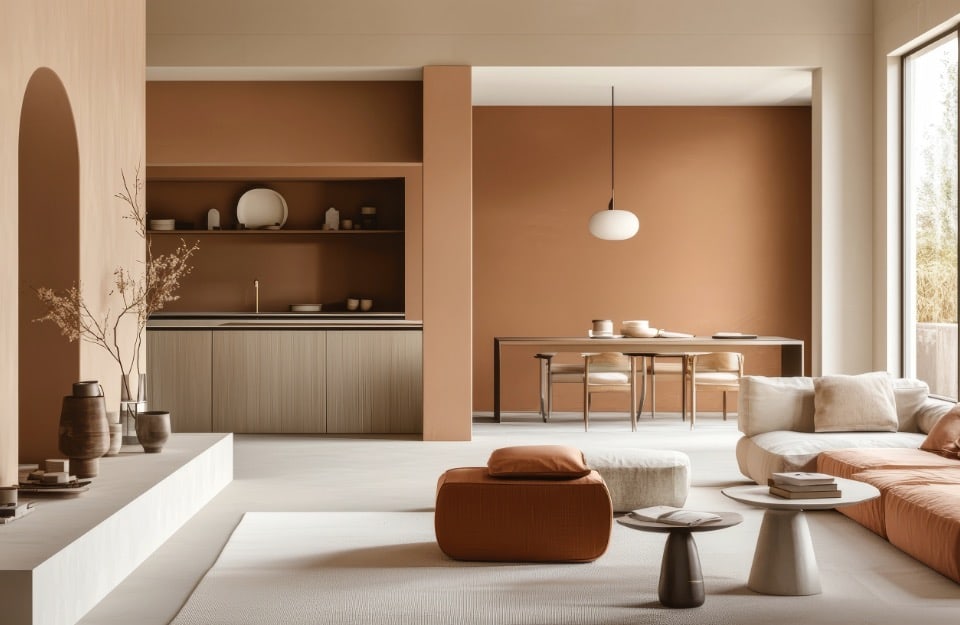
- brown + neutral tones: cream, sand, ivory;
- brown + deep blue or teal;
- brown + olive green or sage green;
- Brown + blush pink or terracotta;
- Brown + gold or metallic details: in this case you can rely on Rio Verde’s Golden Prestige line.
A tip: pair a dark brown with a clay wall or a light bouclé fabric to achieve a warm, contemporary, highly tactile look.
Browns by Style: Which Shade for Each Décor Trend

Brown is an extremely versatile color that adapts elegantly to many interior styles.
- Boho Chic: go for warm, dusty browns like tobacco, cinnamon, and leather, paired with ethnic textiles and natural materials.
- Classic: walnut, chocolate, and truffle are ideal for creating timeless, elegant atmospheres, especially on statement furniture and wainscoting.
- Country: tones like chestnut and caramel suit knotty woods and lived-in finishes for a rustic, welcoming effect.
- Industrial: dark browns such as mocha, leather, and deep greige add strength and materiality to walls, floors, and metal or raw-wood furniture.
- Minimal: dark greige and warm taupe blend perfectly with neutral palettes, creating essential yet enveloping spaces.
- Rustic: chestnut and olive brown evoke nature, authenticity, and patina—perfect on exposed beams, window frames, and floors.
- Scandinavian: when used sparingly, hazelnut or caramel adds warmth to the bright interiors typical of Northern Europe without weighing them down.
- Shabby Chic: marzipan, truffle, and hazelnut (all three part of the Vintage Prestige palette), perhaps with a patinated or distressed effect, lend furniture a romantic, timeworn elegance.
- Vintage: tobacco, leather, mocha, and black cherry recall atmospheres of the past, enhancing reclaimed pieces and iconic 20th-century design items.
Tips & Tricks for Using Brown Without Weighing Things Down
It happens often: you fall in love with a color and use it everywhere… only to find the space has become “too much.” To avoid this mistake:
- counter with light tones: use brown on a single wall or alongside lighter elements;
- leverage texture: matte or waxy finishes make brown feel lighter;
- play with shades: combine light and dark browns to create rhythm.


