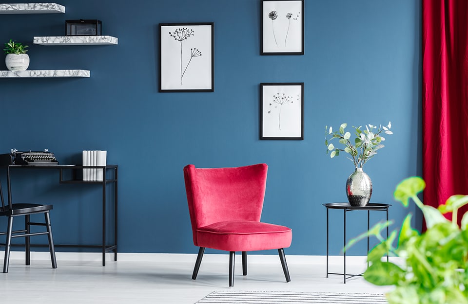
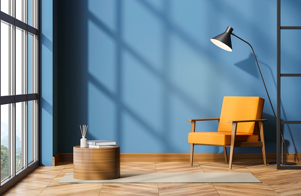
A very elegant, somewhat dull shade of blue with a gray undertone. This is air force blue, a popular color in contemporary interior design, as well as in fashion and cosmetics, mainly because of its restraint and its ability to adapt to many combinations and to “change its soul”-from neutral to vibrant-according to light, materials and color combinations.
What is air force blue color?
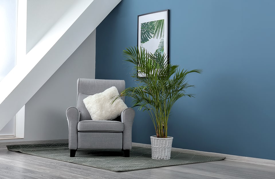 Among shades of blue, air force blue is a shade that can be placed between navy blue and light blue, with a hint of gray and low saturation. It is sometimes simply called gray blue. It is reminiscent of the color of air force uniforms. In English it is referred to as Air Force Blue (for the United States) or Raf Blue (for the United Kingdom). The British Royal Air Force was the first air force to adopt this hue. The reason? Not – as is often reported – because of its resemblance to the color of the sky, but because when the RAF was founded in 1918, the country found itself with a surplus of herringbone twill fabric of that same blue. Intended for the uniforms of the imperial knights of the Czar of Russia, it remained in the warehouses when the Russian Revolution broke out, so it was thought to be used for the uniforms of the new air force.
In which room of the house is it best suited?
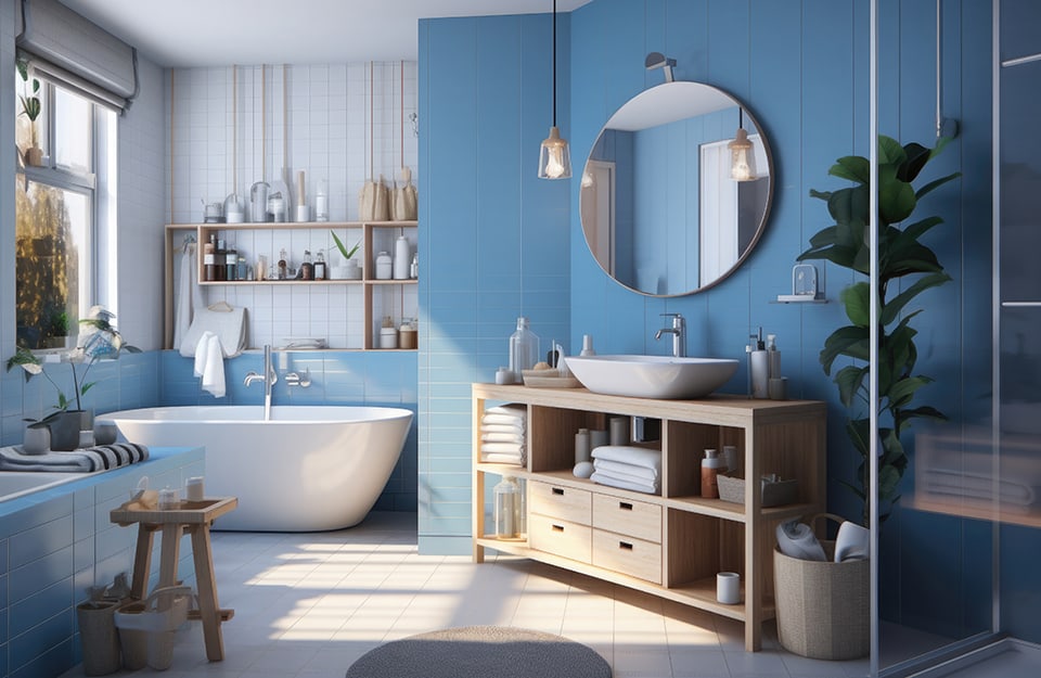 Because of its discreet presence, air force blue can be used in any room and in any mode: either as a primary color or as a secondary or accent color. On the walls, it can be used almost anywhere, from the entrance hall to the dining room, from the living room to the bathroom. However, it is better not to overdo it and leave at least one or two walls white or in a neutral color. In the living room it can be declined on sofas, armchairs and seats, as well as on carpets, curtains and pillows, with different textures, to give depth and visual richness to the room. For the dining room: tablecloth, curtains and possibly console tables and cabinets. In the kitchen: walls or cabinets, perhaps in a two-tone kitchen. In the bedroom: walls and linens. For the bathroom: tiles, fabrics and/or cabinets.
How to match air force blue?
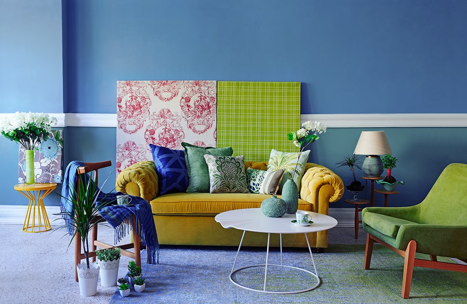 As already mentioned, one of the characteristics of air force blue is its pliability when it comes to color combinations.
- With neutral shades:
- with warm colors:
- yellow: “spiced” such as mustard, turmeric, saffron yellow, or “earthy” such as ochre;
- red-orange: also earthy like terracotta and brick red, bright like burnt orange, lobster and magenta, or dark and deep like cherry and bordeaux;
- With cool colors the combination is more problematic. You can play tone-on-tone or combine air force blu with:
- other blue shades: from baby blue to navy blue;
- shades between blue and green such as teal and petrol green;
- green: from aqua green to deeper, darker shades;
- with pastel colors:
- sauge green;
- pink: from powdery to milkshake, like the one in Rio Verde’s Vintage Prestige range of ultra-matt coatings;
- hazelnut: also part of the Vintage Prestige palette.
- with natural wood in both light and dark shades;
- with metallic shades, especially steel and copper color. In Rio Verde’s Golden Prestige range, we recommend White gold and Brown gold.
What is the difference between air force blue and aniseed? And juniper?
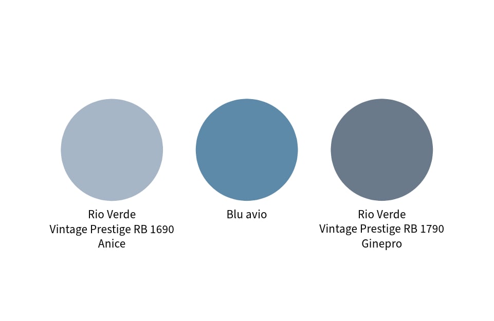
Vintage Prestige is, as mentioned above, Rio Verde’s range of ultra-matt coatings. These are highly matt enamels that can be used on a variety of materials – from wood to metal, glass to plastic, fabric to wall (but only small portions, as they are not breathable) – with the possibility of achieving many different effects. The color palette of Vintage Prestige is oriented toward pastel shades, and among them we find two shades rather similar to air force blue, but less bright: aniseed, which is lighter, and juniper, which is darker. 